Last Updated: 16th April 2025
In today’s digital age, your website needs to look great and perform flawlessly on a wide range of devices, from smartphones and tablets to desktop computers. This is where responsive design comes into play.
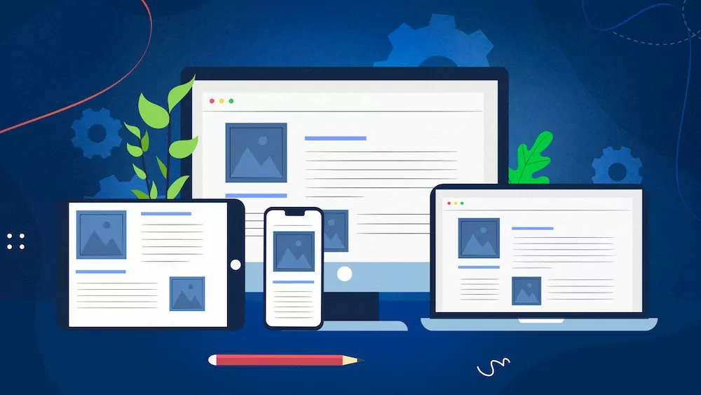
What Is Responsive Design?
Responsive design is an approach to web development that ensures a website adapts seamlessly to different screen sizes and devices. It’s about creating a consistent and user-friendly experience, regardless of how visitors access your site.
Key Elements of Responsive Design:
- Fluid Grids: Instead of fixed layouts, responsive websites use fluid grids that adjust content proportionally to the screen size.
- Flexible Images: Images scale and resize dynamically to fit various screens, maintaining their aspect ratios.
- Media Queries: CSS media queries are used to apply different styles and layouts based on the device’s characteristics, such as screen width.
- Mobile-First Approach: Designing for mobile devices first ensures that the core content and functionality are optimized for smaller screens.
The benefits of responsive design are numerous. It improves user experience, reduces bounce rates, and can positively impact your search engine rankings since Google favors mobile-friendly websites.
By embracing responsive design, you can reach and engage a broader audience while delivering a consistent brand experience.
Have your say
Comments are currently closed for this post