Last Updated: 16th April 2025
As mobile device usage continues to surge, designing with mobile in mind is no longer optional—it’s a necessity. Mobile-first design ensures that your website looks and functions flawlessly on smartphones, which are often the primary devices users turn to.
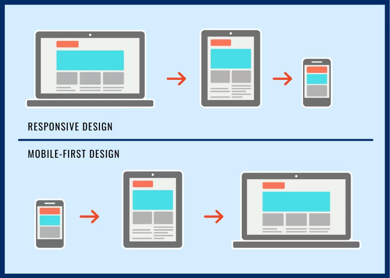
What Is Mobile-First Design?
Mobile-first design is an approach where the mobile version of a website is developed first, and then it’s scaled up to accommodate larger screens like tablets and desktops.
Why Mobile-First Design Matters:
- User-Centric: It prioritizes the needs of mobile users who may have limited screen real estate and slower connections.
- Improved Performance: Mobile-first design promotes faster loading times and efficient use of resources.
- Better SEO: Google and other search engines favor mobile-friendly websites, which can positively impact your search rankings.
- Adaptability: A mobile-first approach makes it easier to adapt to new and emerging mobile devices.
To embrace mobile-first design, focus on responsive layouts, optimize images for mobile screens, and ensure that your site’s functionality works seamlessly on smartphones.
Have your say
Comments are currently closed for this post